

You spend hours writing the perfect title. You polish your description. Yet a shopper scrolls past your listing in half a second. They never read a word of it. Often, the reason comes down to one small square image. Your Etsy listing thumbnail is the very first impression a buyer gets. If it does not stop the scroll, nothing else gets a chance.
Etsy search results show dozens of thumbnails at once. However, they sit packed tightly together on both desktop and mobile. Because of this, buyers are scanning rather than reading. They decide in a glance if something is worth a second look. So if your Etsy listing thumbnail blends in or looks unclear, it gets skipped.
What Is an Etsy Listing Thumbnail, Really?
Your thumbnail is the small square preview image for your listing. It shows up in Etsy search, category pages, shop pages, and favorites. It can even appear in Google Shopping results.
Shoppers never see your full photo gallery before they click. Instead, they see one small image. Often it is on a phone screen. It competes for attention against ten or more other thumbnails on the same row. But according to Etsy’s own image guidelines, the platform recommends photos of at least 2000 pixels on the shortest side. That first photo gets reused and cropped across many placements.
This is why an Etsy listing thumbnail is not just another product photo. It has to work as a tiny advertisement on its own. In a space smaller than a postage stamp on a phone, it must show the product, the style, and sometimes the value, all at once.
Table: What an Etsy Listing Thumbnail Needs to Communicate
| Question a buyer asks in one glance | What your thumbnail should show |
|---|---|
| What is this item | Product filling most of the frame |
| Is it good quality | Sharp focus, clean lighting |
| Is it for me | Style, color, or use case at a glance |
| Is this shop trustworthy | Consistent, professional presentation |
| Does it stand out | A visual detail different from similar listings |
Why Buyers Scroll Past an Etsy Listing Thumbnail Instead of Clicking
There are a few common reasons an Etsy listing thumbnail fails to earn a click. This happens even when the product itself is genuinely good.
For example, the image is too zoomed out. The item becomes a tiny detail lost in a busy background. Similarly, the lighting is dim or yellow toned. This makes colors look muddy next to brighter competitors. In other cases, there is no context at all. A buyer cannot tell the scale, material, or use case from the image alone.
In addition, the composition often looks nearly identical to other shops selling a similar item. Nothing sets it apart. Meanwhile, on mobile, where most Etsy traffic happens, small text or fine details simply disappear.
Table: Weak Thumbnail vs Strong Thumbnail
| Element | Weak Etsy Listing Thumbnail | Strong Etsy Listing Thumbnail |
|---|---|---|
| Framing | Product is small, lots of empty space | Product fills most of the frame |
| Lighting | Dim, yellow, or harsh shadows | Bright, natural, true color |
| Background | Cluttered or distracting | Clean, simple, complementary |
| Context | No sense of size or use | Shows scale or a lifestyle setting |
| Text overlay | Missing or unreadable on mobile | Short, bold, legible on a small screen |
| Consistency | Looks random next to other listings | Matches a recognizable shop style |
5 Proven Fixes for Your Etsy Listing Thumbnail
1. Fill the Frame With the Product
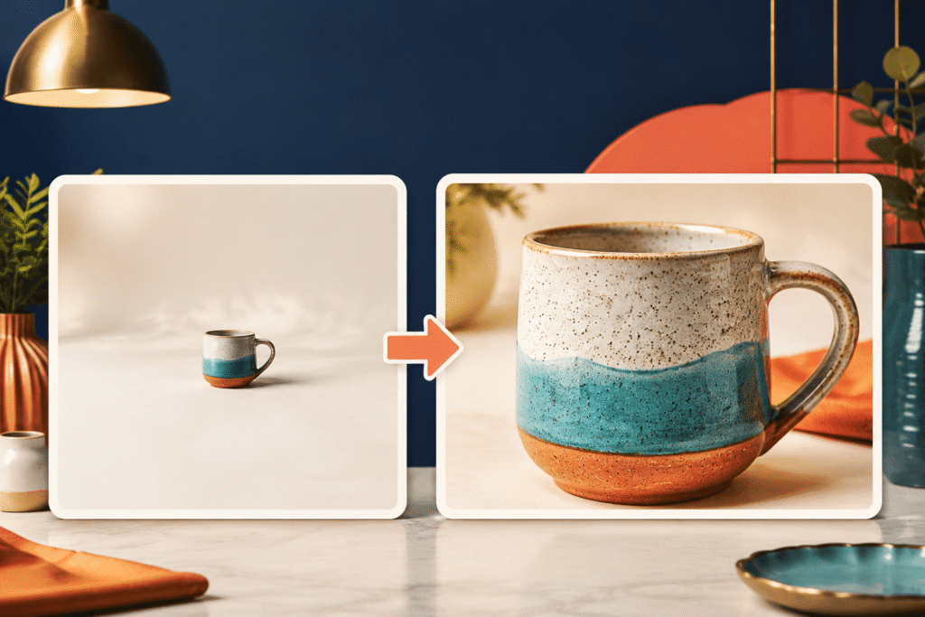
First, zoom in so the product fills most of the square. That way, buyers can recognize it within a split second, without squinting.
To start, crop tightly. Then, keep the background simple. Let the item be the obvious focus, not just one small piece of a larger scene. Notably, Etsy’s own product photography guide backs this up. It notes that clear, bright photos are what catch a shopper’s eye at thumbnail size.
2. Fix Your Lighting Before Anything Else
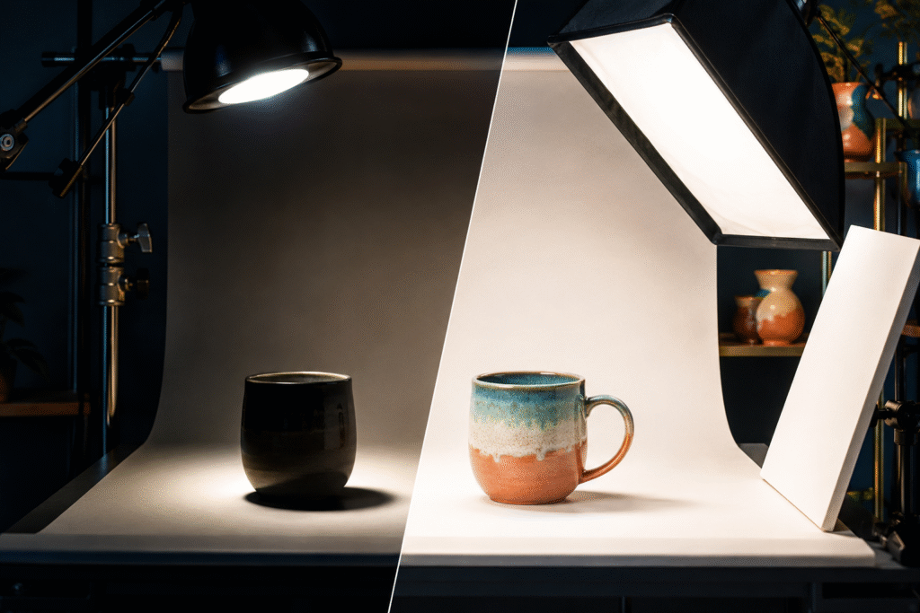
For instance, natural daylight near a window makes a real difference. A simple softbox works too. As a result, true to life color builds trust. It also sets accurate expectations for what a buyer will receive.
In fact, sellers who switch from yellow indoor lighting to daylight often notice their photos look more professional overnight. That one change alone can shift how often an Etsy listing thumbnail gets clicked in search.
3. Add Short, Readable Text Overlays When It Fits the Niche

For items like printables, templates, or personalized goods, a short line of bold text helps a lot. Something like Custom Name Mug or Editable Canva Template can instantly clarify what the product is.
However, keep the font large and simple. It still needs to read clearly at a small size on a phone screen. In particular, sellers of digital products such as Canva templates lean on this technique heavily. A static image alone cannot show that a file is editable. For a closer look at how digital sellers structure listings around this kind of clarity, this breakdown of proven ways to get more sales with Canva templates on Etsy walks through the process.
4. Build a Consistent Visual Style Across Your Shop

When every Etsy listing thumbnail in your shop shares a similar background, font, or layout, your listings become instantly recognizable in search. In other words, it works almost like a small brand identity.
Indeed, shoppers browsing a search page notice repeated, cohesive shops more than scattered ones. As a result, that recognition builds trust before they even click. For sellers building out a full catalog, this same consistent style is worth applying across every listing. It pairs naturally with the workflow described in this guide to selling Canva templates on Etsy.
5. Test and Compare Real Performance Data

First, check Etsy Stats for views and clicks on each listing. Next, swap out an underperforming Etsy listing thumbnail. Wait a couple of weeks. Then compare the click through numbers before and after.
Generally, sellers who treat this as an ongoing habit see steady improvement over time. After all, what works can shift with trends and seasons. It can even shift when Etsy changes its own search layout. Testing regularly matters more than getting it perfect on the first try.
Table: How Sellers Typically Test Thumbnail Changes
| Step | What to Do | What to Watch |
|---|---|---|
| 1 | Note current views and clicks in Etsy Stats | Baseline click through rate |
| 2 | Replace the thumbnail only | Keep title and tags the same |
| 3 | Wait two to four weeks | Allow enough impressions to compare fairly |
| 4 | Compare new stats to baseline | Change in clicks per view |
| 5 | Keep or revert | Repeat with the next weakest listing |
Real Results Sellers Report After Improving Their Etsy Listing Thumbnail
Overall, sellers across handmade goods, printables, and digital templates describe a similar pattern. But after reworking their thumbnails, more impressions start turning into actual clicks. Favorites tend to rise within the first few weeks too.
Notably, the product did not change. The description did not change either. So the only variable was how the listing looked in that first glance. This shows just how much weight the Etsy listing thumbnail carries in the overall sales funnel. Etsy’s seller handbook makes a similar point in its guide on essential product photo types. It explains that a great product photo grabs attention before a shopper reads anything else.
FAQ
What size should an Etsy listing thumbnail be?
Etsy recommends photos with a minimum dimension of 2000 pixels on the shortest side. This comes from Etsy’s official image requirements. The thumbnail itself is a cropped version of your first listing photo.
Does the Etsy listing thumbnail affect search ranking?
The thumbnail image is not a direct ranking factor by itself. However, a higher click through rate from a strong thumbnail can help how Etsy’s search treats a listing over time.
Should I use text on my Etsy listing thumbnail?
Text overlays work well for digital products, printables, and personalized items. This is true when the image alone cannot show key details. Keep the text short, bold, and easy to read on mobile.
How often should I update my Etsy listing thumbnail?
Check performance every few months. Also review it whenever a listing’s views are not converting into clicks. Both are reasonable habits for most shops.
Can a better Etsy listing thumbnail increase sales without changing the product?
Yes. However, the thumbnail determines whether a buyer clicks at all. Improving it can bring more traffic to a listing that was already good but simply was not being seen.

Pingback: AI-Generated Digital Products on Etsy: 5 Mistakes & solution
Pingback: Seasonal SVGs: How to Price and Sell for Profit